


In honor of the 150-year anniversary, check out our take on the history, development, and design of Kentucky Derby logos.
The history of design at The Kentucky Derby
The evolution of Kentucky Derby logo design
What makes a great Kentucky Derby logo?
Why we love Kentucky Derby logos
The Kentucky Derby may be known as "The Greatest Two Minutes in Sports," but even more interesting is the spectacle around the event. We're talking extravagant outfits, high-rolling bettors, and the fastest horses on earth, all contributing to the Derby’s long history. All these traditions are embodied in the yearly logos commissioned for the race, a more recent tradition in the event’s 150-year history.
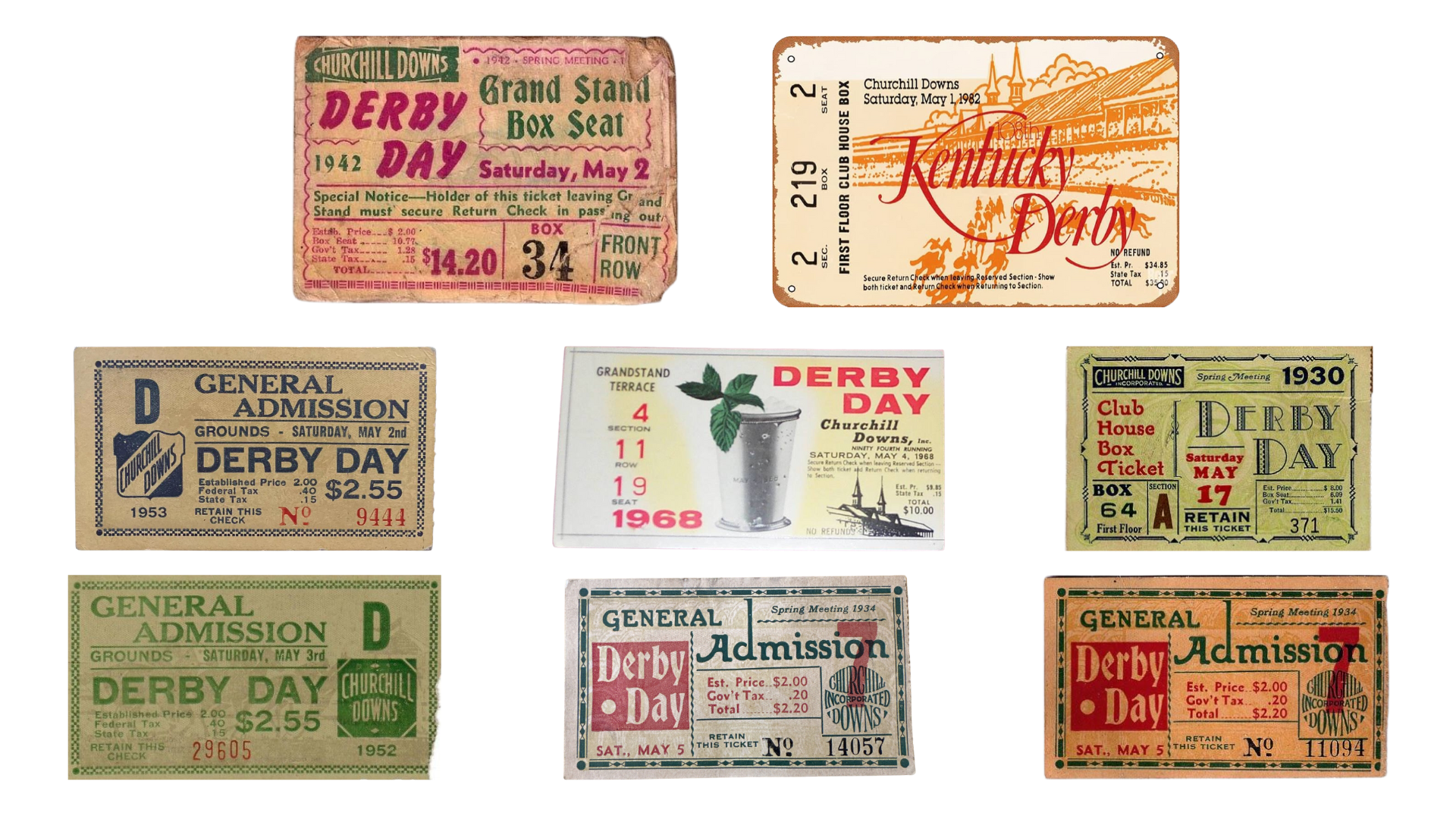
The design of these logos is not well documented pre-1994, but early versions of the tickets laid the groundwork for the logos that we see today. These ticket designs didn’t utilize as many graphic elements, instead opting for the font choice and layout to create interest. The bold, marker-drawn italic font used in 1942 gives a sense of motion, excitement, and revelry that is tied to the derby. Looking at the 1982 ticket, the designer used a thin, sweeping serif font with the backdrop of the grandstand, Twin Spires, and horses to achieve a similar goal.
Since the 127th running of the Derby in 2001, branding agency MogoSME has designed the logos that are tied to each event. Most logos use the same three elements: the Twin Spires that sit atop the main grandstand, a rose, and of course, the horses. They’re designed to generate excitement around the race, and become synonymous with the results, drama, and spectacle that each year holds.
The overall design of the logo follows trends popular during that year, similar to the logos created for the Super Bowl, NCAA Basketball Final Four, and World Series. Looking at 2008 and 2014, we can see some clear trends that tie the logos together.
In 2008, curvy and color-filled logos were all the rage. Sprint, Pepsi, and Nikon all rebranded around that time and shifted to logos similar to the style seen in the Kentucky Derby and others. They utilized a variety of accent colors, motion, and unique elements.
.png)
Looking at 2014, we can see the simplification of many logos. Brands said goodbye to the colorful accents in exchange for clean, sharp edges and drop shadows.
.png)
The Derby is such a unique event in the world of sports, and the logos pay homage to the history of it while also drawing in new viewers. Here’s our take on what makes Derby logos stand out:
The Kentucky Derby relies on a few key elements such as the Twin Spires, the Grandstand, and the horses that distinguish it from other events. Being able to lean into these elements not only creates association with the derby, but re-enforces the elements as individual icons.
This is what the Derby is all about. It’s the reason why — after 150 years — people still watch from all over the world, whether they’re betting, following the latest fashion trends, or just curious about the spectacle.
Each year, the Derby has many of the same traditions, so the designer has the challenge to make each year’s logo special. This upholds the uniqueness of the drama, results, and iconic moments that each edition brings.
With these criteria in mind, we picked our top three Kentucky Derby Logos! All of these logos caught our eyes for different reasons, but they all have one thing in common: they get us excited to watch the race!
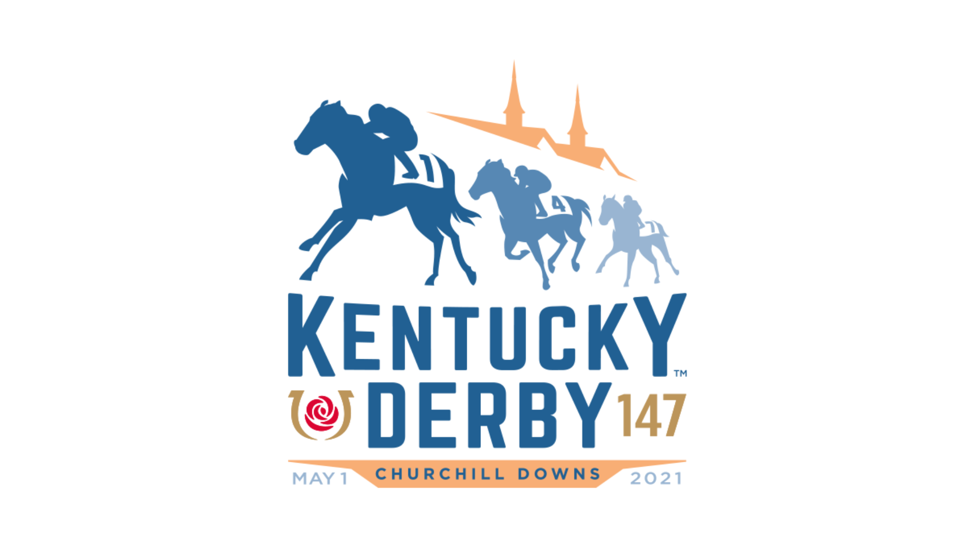
The 2021 logo showcases the speed and movement of the horses racing under the Twin Spires, and the tapered “Kentucky” gives it the feel of an iconic sporting event. It’s like you're right next to the action! The peach spires aren’t our favorite because of the way the color gets lost behind the blues, but overall we like how the shape adds depth to the logo and works with the angle of the tops of the horses.
We love this logo for many reasons, but the strong complement of the colors makes each individual element really stand out. This type of muted color palette is an excellent way to highlight the icons and motion of the logo. The composure of the jockey and confidence portrayed by the horse are representative of a winning pair. In addition, the serif and sans serif font combo and colors create a clear hierarchy by placing emphasis on the “Kentucky Derby” which is nicely underlined by “Churchill Downs.”

Drumroll please…. Here’s our big winner!
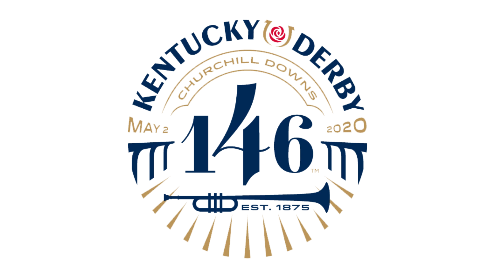
This logo needed to be a hit after the pandemic lockdowns of early 2020, and it delivered. It channels the excitement, motion, and revelry that is the Kentucky Derby. No other logos feature “Est. 1875”, which we believe was included to showcase that in the face of conflict (even a World War), the Kentucky Derby goes on. The gold and blue work together to create visual hierarchy, and instead of featuring horses, the logo makes the viewer the jockey, and it feels as if they are barreling down the track with the sound of the crowd surrounding them.
The Kentucky Derby is one of the most unique, iconic, and exciting sporting events in the world. The logos that represent the race are a testament to the importance of unique, yet cohesive, branding that becomes the face of the event — both in the run up to the big day and in the years to follow. Fans are hooked on the unique and iconic elements of the Kentucky Derby, and the logos are just one piece of that puzzle. It keeps them coming back every year, and helps uphold the high standards of entertainment that fans expect. We can’t wait to see what the Kentucky Derby comes up with next!