Your business or organization’s name is essential for brand recognition. An outdated or inaccurate name could be holding you back. How do you create a name that is easily recognizable and equally representative of your work?
A representative name that sparks room for growth
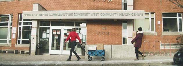
Addison County Community Trust (ACCT) is a nonprofit in Addison County, Vermont that works to provide safe, quality, affordable housing for families, seniors, and individuals. Since its creation in 1989, the nonprofit has experienced ongoing growth, developing new programs to better serve the community.
However, the name “Addison County Community Trust” no longer fit the organization’s expanded programming and evolved mission and goals. Our task was to uncover a brand name to better suit their organization today and for many years to come.
Discovering a strong name and logo
This nonprofit’s work addresses a very sensitive, personal, and political subject: affordable housing. Because of this, a major priority was to include key stakeholders in the research and discovery phase of the rebrand process. Residents, community members, donors, board members, staff, and more were included in the surveys, workshops, and focus groups that influenced our creative direction. A significant portion of this phase was simply listening. It was important for us to understand all opinions and perspectives before starting our iterative branding process. This research focused on current brand perception, brand sentiment, and what words they associate with the organization.
After gathering input from a wide variety of stakeholder groups, we got to work presenting different name concepts and directions. The nonprofit wanted to keep the county they represent, Addison, in the name. To better represent the work they do, the word “housing” was also necessary. After several name iterations, the team felt most excited about “Addison Housing Works.” Broken down, this name represents exactly what the nonprofit does: they serve Addison County, work to improve housing cost and availability, and know that affordable housing works— when a community invests in affordable housing, it has a ripple effect.
 Finalizing the organization’s new name came with logo iterations to match. Plugging the name into various logo designs allowed the ACCT team to imagine how the name would look when incorporated into their brand identity. Adapting a design from a former ACCT intern, the final logo included multiple shades of green, depicting local mountains and two houses in the middle— welcoming colors with a design that shows exactly what they do.
Rolling out the rebrand with confidence
With a new name, logo, and brand guidelines, Addison Housing Works knew that the rebrand process didn’t end there. Strategically rolling out the new brand is key for public acceptance and adoption. The organization opted to utilize our add-on brand rollout and implementation services.
The rebrand rollout process focused on the nitty gritty. A 30+ year old organization like Addison Housing Works has its branding everywhere. An audit of their online presence and print materials identified all places where its branding exists so we could update it, ensuring brand recognition and cohesion. Our audit revealed the need to update the Addison Housing Works website branding, website and email domain, social media profiles, signage, stationary, apparel, and merchandise.
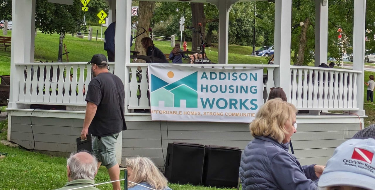
.png?width=224&height=277&name=b7b5b023bcb%20(3).png) For Addison Housing Works, we recommended announcement content, including a blog post, press release, marketing email, newspaper ad, and social media post. The nonprofit planned to reveal the new name and logo at its annual appeal event, “Addison Housing Rocks!” Our team supported event content including teaser language, four weeks of social media content approaching the event, a magazine promotional graphic, and a banner for the grand reveal.
For Addison Housing Works, we recommended announcement content, including a blog post, press release, marketing email, newspaper ad, and social media post. The nonprofit planned to reveal the new name and logo at its annual appeal event, “Addison Housing Rocks!” Our team supported event content including teaser language, four weeks of social media content approaching the event, a magazine promotional graphic, and a banner for the grand reveal.
For the blog, press release, and marketing email, our copywriting team focused on providing background information that explains the reasoning behind the decision to rebrand and highlighted the care that was dedicated to the process. The goal was to share the rebrand process and intention with Addison Housing Works’ existing audience, as well as seize the opportunity to shine a light on the organization and attract new supporters.
 The social media content created followed Addison Housing Works’ new brand guidelines, integrating colors and fonts that would soon be associated with the organization. Our team provided Addison Housing Works with social media post graphics, captions, and a content calendar to ensure that the posts followed timing best practices.
To establish brand awareness of the new name and logo while sunsetting the old brand, we designed a newspaper advertisement for the Addison Independent. This local newspaper was most likely to reach Addison Housing Works’ primary audience, Addison County residents.
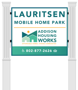 An important piece of branding that is highly visible throughout Addison County are the signs located at each of the properties. We designed and coordinated new signage for these properties to bring the organization’s new branding to the forefront. When community members see an Addison Housing Works sign at one of their properties, they recognize that it belongs to the organization. If they underwent the rebrand but didn’t update their signs, people might assume that Addison County Community Trust and Addison Housing Works are two different organizations. Cohesive, established, and clear branding gives the organization more credibility.
.png?width=209&height=677&name=Untitled%20design%20(85).png) Our audit also revealed that the organization would need updated stationary including letterheads, business cards, several types of envelopes, and thank you cards. We designed and procured these materials, so the new brand was immediately displayed on all print materials. Addison Housing Works’ staff is very hands-on and involved in the work that they do. Print materials are necessary for their boots-on-the-ground fundraising, grant writing, and property management work, so updating print branding was a major priority for this project.
Our audit also revealed that the organization would need updated stationary including letterheads, business cards, several types of envelopes, and thank you cards. We designed and procured these materials, so the new brand was immediately displayed on all print materials. Addison Housing Works’ staff is very hands-on and involved in the work that they do. Print materials are necessary for their boots-on-the-ground fundraising, grant writing, and property management work, so updating print branding was a major priority for this project.
Leadership at Addison Housing Works wanted to use this rebrand as an opportunity to bring the organization’s brand to the board and staff members. Prior to the rebrand, board and staff members didn’t have any kind of uniform or identifier that verified their connection to the organization. Improving this was important, particularly for maintenance staff who are often on-site maintaining Addison Housing Works’ properties. We designed and procured merchandise including t-shirts, polos, hoodies, hats, name tags, and car magnets to boost board and staff members’ credibility. In addition to creating credibility, the merch worn by board and staff members increases brand recognition and awareness in the community, reaching potential and current residents and stakeholders. With the new merch, board and staff members look like a team.
The last step was a website and social media flip, updating the brand colors and fonts, as well as editing every place on the website that mentioned the organization’s name, including the domain. We also updated the organization’s social media profiles, including their profile picture, name, description/bio, handle, and link in bio. This website and social media flip updated the nonprofit’s digital presence to accurately represent the new brand, creating brand unity in the print and digital worlds.
Impact: a representative new identity
Addison Housing Works has a strong impact in the Addison County community and beyond. This new identity opened the doors for a new chapter for the organization, setting them up for continued growth. The new, accurate branding improves the nonprofit's relationship with the community, providing clarity when connecting with residents and key stakeholders, and attracting new donors.
Support Addison Housing Works’ mission by visiting their website to make a donation.
"We had a terrific experience working with LONDONMiddlebury on our rebrand of Addison Housing Works. As a small nonprofit with 35 years of history in our community, finding the right process was as important as the final outcome. From listening and gathering input to creating and rolling out our new name and logo, [LM] made sure all our stakeholders felt confident in our new direction, and we ended up with a great result. Our new identity hits the nail on the head when it comes to what we do and the image we want to project, and the feedback from the community has been fantastic!"
- Elise Shanbacker, Executive Director